
About DNS Zone Management

DNS Management Services in the F5 Distributed Cloud (F5 XC) allows clients to manage their DNS infrastructure.
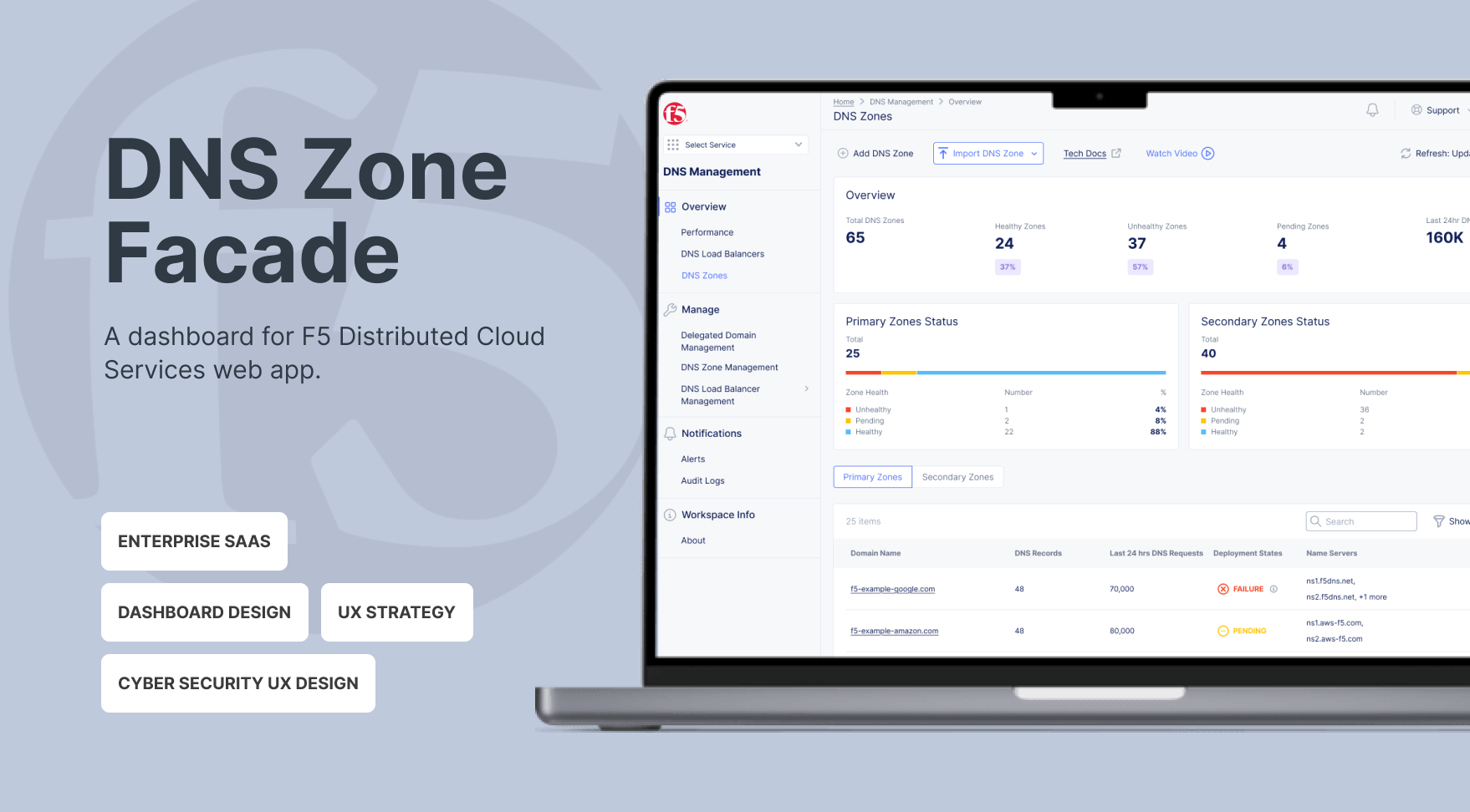
A DNS zone represents all authoritative records for a specific domain or subdomain, giving NetOps teams a clear, focused view of the data that actually drives service availability. Since DNS failures directly impact uptime, NetOps need real-time insight into zone health, record distribution, and synchronization status—so they can quickly identify issues and take action.
Currently, the service’s interface is structured around backend systems rather than operational workflows, making troubleshooting slower and reducing confidence in DNS management.
My Role

I led the UX strategy and execution as the sole designer on the project, I partnered closely with a Project Manager and an engineering team to drive the end-to-end design process. I synthesized complex client challenges into actionable insights and developed a persona that aligned stakeholders around a shared understanding of user needs. This resulted in clearer decision-making across teams and improved implementation efficiency.
Through multiple iterations and cross-functional reviews, I translated strategic decisions into practical design solutions. I delivered high-fidelity designs and a structured handoff, ensuring engineering feasibility and smooth implementation.
What blocks NetOps

As the system grew, engineers faced increasing difficulty in managing DNS zones efficiently.
Key challenges included:
- High cognitive load when navigating large configuration structures
- Increased risk of misconfiguration due to fragmented visibility
- Slower deployment cycles caused by manual review and verification processes
This created operational friction and reduced confidence in system changes. The core issue was not DNS performance itself, but the increasing complexity of decision-making within the configuration system.
The foundation of the design
The inefficiencies signaled the need to reframe the problem.
How might we
- Make NetOps understand the overall situation of their services immediately
- Improve awareness of the problematic zones
- Facilitate NetOps’ decision making in prioritizing zones with issues and troubleshooting
Strategy
NetOps users are navigated by operational intent instead of tabs. They think in questions: “Is it working?”, “Why”, “What do I do”. To answer their questions, I proposed my strategy:
- State before detail: Operational state must be scannable in under 5 seconds when NetOps users coming to the dashboard.
- Status must be explainable: “Failed” is not a status—it’s a dead end.
- Optimize for the worst situation: Design for the highest-pressure scenario, not the calm one.
Key Decisions & Trade-offs
Decision 1: Introduce a unified operational overview

We created a consolidated zone-level dashboard that provides:
- Zone availability: NetOps can immediately see the number of healthy, unhealthy, and pending zones at a glance.
- Last 24-hour DNS requests: This shows overall DNS traffic volume, allowing NetOps to quickly assess system load, understand the impact of unhealthy zones, and prioritize actions.
This approach preserves familiar workflows for users and reduces engineering risk, enabling us to deliver impact more quickly.
Trade-off: We did not fully restructure navigation. Instead, we layered an overview panel. This allowed us to improve visibility and decision-making speed without disrupting established operational workflows. While this preserved familiarity and reduced engineering and adoption risk, it limited the degree to which we could fundamentally simplify the underlying information architecture.
Decision 2: Separate Primary and Secondary Zone Status in the Overview

We had a heated discussion about how to present Primary and Secondary Zone status. Primary zones only have deployment status, while Secondary zones include both data transfer and deployment status.
I recommended introducing two separate overview cards: one for Primary Zone Status and one for Secondary Zone Status, each displaying the number of healthy, unhealthy, and pending zones. This structure enables NetOps to quickly grasp the overall health of the DNS system at a glance.
Although this reduces immediate problem specificity at the overview level, detailed root-cause information can be accessed through drill-down views or secondary dashboards. This approach prioritizes clarity and speed in the high-level overview while preserving diagnostic depth when needed.
Tradeoff: For Secondary Zones, the “unhealthy” status does not differentiate whether the issue originates from deployment or data transfer.
Decision 3: A separated view for Primary zones and Secondary zones details

Primary and Secondary zones involve different information. I chose to separate Primary and Secondary zones into tab views to maintain structural clarity and consistent data semantics within each table.
Since the overview cards already provide high-level visibility into Primary and Secondary zone health, NetOps can determine which category to prioritize before entering the detailed view. Separating the tables reduces cognitive load, avoids conditional or empty fields, and simplifies sorting logic.
Tradeoff: Users need to switch between tabs to compare across zone types. However, this interaction is intentional and task-driven rather than exploratory, aligning with how NetOps typically approach operational troubleshooting.
Decision 4: Add Record Type breakdown visualization

Previously, users manually scanned long record tables. It requires cognitive load to do mathematics. To facilitate troubleshooting, we added: Total record count and Distribution by type. To keep the readability of lengthy data for users, we only showed top 7 records. What they need was structural visibility, not historical analysis.
Trade-off: We only showed top 7 records, and avoided advanced visual analytics, e.g. trend charts over time.
Impact
Designed a risk-aware DNS operations dashboard that reduced cognitive load for NetOps users and enabled faster, impact-driven decision-making during multi-zone failures.
Although full quantitative metrics were limited due to the staggered rollout, client feedback was positive, highlighting “clearer failure explanations” and “easier visibility of zone status.”
What I Learned
Working on this dashboard taught me that infrastructure UX is really about trust. Users don’t just care that a system works—they care that they can understand it. Even the most stable systems lose credibility if failures or statuses aren’t clear. Clarity and explainability directly shape confidence.
Finally, incident-mode thinking changes everything about priorities. When stakes are high, aesthetics take a back seat to speed of scanning, clarity of errors, and actionable insights. In those moments, what matters most is helping users make fast, confident decisions.
Future Opportunities
If expanded further, I would:
-
Add historical sync reliability metrics
- Show failure reason distributions
-
Explore proactive alerts within the dashboard