
Context & Problem

When I joined the FirstNet Push-to-Talk project, the product had already evolved over several years—but without a unified design foundation. This created several critical challenges.
- Lack of design principles:Frequent designer turnover meant there was no shared understanding of design standards or guiding principles.
- Breakdown in cross-functional collaboration:Designers repeatedly proposed solutions that had already been flagged as infeasible by engineering. This led to frustration, wasted time, and eroded trust between teams.
- Severe inconsistency across the product:Each version reflected different design styles, resulting in a fragmented and confusing user experience.Designers, engineers, and QA all struggled to determine the “correct” version of UI patterns.
- High operational inefficiency:Teams spent 1–3 days per feature just confirming basic elements, like icons and colors (especially grayscale usage).
- Growing complexity without documentation:As the product expanded, there was no centralized reference. Designers often created solutions that were redundant or misaligned with existing patterns.
This environment made it difficult to scale the product, onboard new team members, or maintain design quality—especially for a mission-critical tool used by first responders.
My Role & Responsibilities
I’m the lead designer on this project, and I took on multiple roles:
- Conducted design audits
- Defined the structure and content of the design system library
- Authored documentation
- Led training sessions for designers
- Facilitated cross-functional onboarding for engineers and QA
I acted as both a system architect and a bridge across teams, ensuring the system was not only created—but adopted.
Process & Approach
Defining Principles, Goals, and Foundations

I started by aligning the system with user needs and operational context. Our primary users—first responders—operate in high-pressure, time-critical environments. The followings are defined at the beginning.
Design Principles
- Zero Cognitive Load:Interfaces must be predictable and unambiguous. Users should never need to “figure out” how the UI works, regardless of stress level.
- Glove-Friendly First:All interactive elements must have a minimum touch target of 60×60 dp, ensuring usability with firefighting or medical gloves.
UX Goals
- Enable single-handed operation for 80% of tasks
- Ensure low learning curve (each task completable within ~30 seconds)
- Maintain clear and visible system status
- Guarantee emergency alert access from any screen
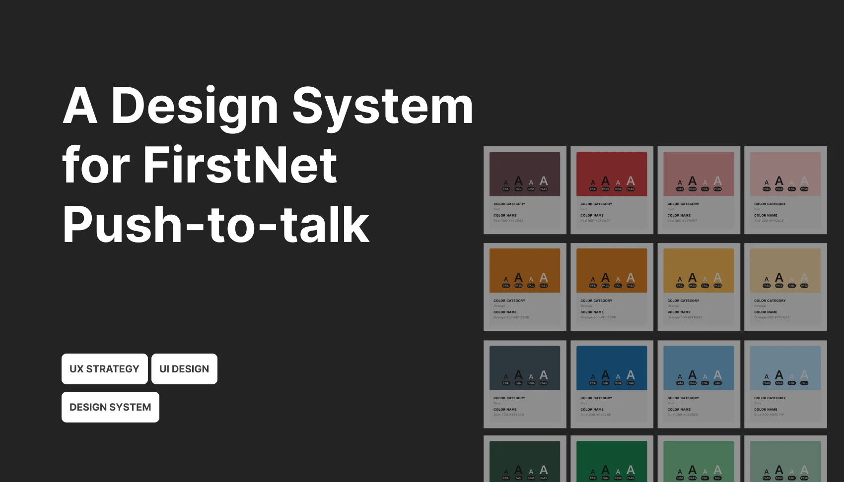
Foundations
- Color system
- Typography
- Iconography
- Spacing
- Accessibility guidelines
Audit & Simplification (Subtraction over Addition)
I conducted a component audit by identifying high-frequency issues from daily workflows. I collaborated with designers on my team to collect screens, use cases, and components. We evaluated all elements against the new principles and foundations.
A key strategy was intentional reduction—prioritizing clarity and simplicity over feature accumulation.

Take Push-to-Talk Button as the example. Previously, the PTT button used multiple colors. While technically descriptive, this system increased cognitive load. First responders had to interpret color meanings under pressure—slowing them down.
Additionally, these color variations were newly introduced in the latest version only and did not demonstrate clear user benefits.

We discussed deeply and eventually decided to eliminate unnecessary variations and simplified the interaction model to reduce ambiguity and cognitive burden.
Documentation & System Implementation

Once decisions were finalized, I built the design library and created comprehensive documentation that includes defined usage guidelines and patterns.
To ensure consistency and scalability in the future:
- Designers were required to log all changes
- The team adopted the system to produce the latest app guide and handoff materials
- All new designs were expected to align with the system
Cross-Functional Adoption
I initiated sessions with different stakeholders to drive adoption. With designers, I focused on “How to use the system and contribute updates”; with developers, I mainly introduced “How to access design specs and handoff files (e.g., navigating Sketch files and dev-ready assets)”; with QA/Testers, I talked about “How to validate designs using system standards”.
I also provided some prototypes that our team created for interaction clarity, and written descriptions for expected behaviors.This ensured the system was not just documented—but actively used across teams.
Impact & Outcomes
The design system makes some impact:
- 50% reduction in design time
Designers could move faster and deliver more efficiently. - Eliminated repetitive style confirmations
Reduced back-and-forth between design, engineering, and QA. - Improved knowledge distribution
Design decisions were no longer dependent on senior designers.
New team members could independently reference the system and answer implementation questions. - Shifted focus to higher-value discussions
Teams spent less time debating colors and icons—and more time on interaction quality and product decisions.
Challenges
Building the design system was really challenging.

Fragmented UI across multiple versions
By the time a product reaches its fourth version without a design system, what exists is not a cohesive interface but a collection of inconsistencies accumulated over time.
Similar components often have multiple visual styles, spacing rules vary across screens, and interaction patterns are not aligned. Instead of building a system from scratch, the team must first untangle and reconcile these discrepancies, which turns the process into one of design “archaeology” rather than straightforward system creation.
Decision overload and alignment challenges
As components are audited and consolidated, the team will repeatedly face difficult decisions about whether to adopt existing patterns, refine them, or redesign entirely.
Without clearly defined design principles, these decisions can quickly become subjective and contentious. Product managers may prioritize speed and roadmap commitments, engineers may push back due to implementation costs, and designers may have differing opinions on quality and consistency. This often leads to prolonged discussions and slow progress.
Engineering resistance due to accumulated technical debt
After multiple product iterations, the front-end codebase is typically not structured to support a design system. UI elements may be hard-coded, components may lack reusability, and inconsistencies are often deeply embedded.
Introducing a design system at this stage can be perceived by engineers as a costly refactor rather than a necessary investment. Without strong alignment on its value, adoption may stall, resulting in a system that exists in theory but is only partially implemented in practice.
Reflection
Start with foundations
Instead of attempting to create a fully comprehensive, all-encompassing design system upfront, it is more effective to take a layered approach.
I prioritized building the system incrementally, focusing first on the most foundational elements before expanding outward. This reduces risk, speeds up adoption, and prevents the system from becoming overly theoretical or disconnected from real product needs.
Define design principles before making UI decisions
Before redesigning any components, it is critical to establish clear design principles. Questions such as whether to prioritize consistency over flexibility, speed over polish, and how much legacy support to maintain should be explicitly addressed early on.
These principles act as a decision-making framework, reducing subjective debates and enabling faster, more aligned choices across design, product, and engineering teams.
Start with a focused entry point rather than a full overhaul
Trying to migrate the entire product at once often leads to stalled progress and organizational resistance. A more effective strategy is to identify a clear entry point, such as applying the design system to all new features or fully migrating a specific user journey. This allows the system to evolve organically within the product, demonstrating value in real use cases rather than being imposed top-down.