
About FirstNet Push-to-Talk app
FirstNet® Push-to-Talk (FNPTT) is a mission-critical communication platform designed for first responders operating in high-risk, time-sensitive environments.
Developed in collaboration with AT&T, FirstNet, and Samsung, FNPTT bridges traditional Land Mobile Radio (LMR) systems with modern mobile networks—enabling real-time voice, video, and data sharing across agencies during emergencies.
However, designing for FNPTT goes beyond feature delivery. First responders must communicate under extreme conditions: limited attention, high stress, and unreliable network environments. At the same time, the system must support large-scale coordination across multiple departments while ensuring network priority, security, and reliability.
This project focuses on how we redesigned the communication experience to reduce cognitive load, improve clarity under pressure, and support seamless coordination in critical moments.
Problem: design by accretion

Since its launch in 2018, FNPTT has rapidly scaled to support over 27,500 public safety agencies and 5.5 million connections nationwide, becoming a critical communication tool for first responders.
However, despite this growth, key usage signals began to decline. Active users dropped, and overall data transmission—including calls, messaging, and multimedia—decreased by 67%, indicating a significant disengagement from the platform.

Through stakeholder interviews and product analysis, we identified a deeper issue: FNPTT had evolved rapidly without a clear product strategy or unified vision. Feature development was primarily driven by technical requirements rather than a holistic understanding of user needs.
At the same time, first responders operate in high-stress, time-critical environments where attention is limited and clarity is essential. The increasing number of features, without clear prioritization or intuitive structure, led to fragmented workflows and rising cognitive load.
This resulted in a critical disconnect between system capability and real-world usability—ultimately contributing to decreased engagement and usage. The problem was not feature expansion, but the lack of prioritization under high-pressure scenarios.
My Role & Goals

Our project aimed to recapture a moment of glory. The original premise was straightforward: tap a button and talk. However, our objective was not to revert to a simpler past; instead our high level goals was to: Ensure seamless and efficient communication, verbal and non-verbal, for responders and dispatchers in any situations.
I led this project in collaboration with 2 other designers from Aug 2023 to Feb 2024. I defined the strategy to address the problem and worked closely with 2 product managers, 1 network team, and 2 developing teams. I participated in the end-to-end design process, focusing a cohesive and user-centered approach to ensure communication efficiency.
Kickoff – Picking up the pieces
At the outset of this redesign, we didn’t have a clear about responder’s communication experience. Without user insights, we decided to go knocking on every responder department’s door in Seattle and listened to them.

Early insights from the field
We conducted the user research on the current app with 6 participants. The goal was to understand the challenges responders faced and the workarounds they employed. Although the app was designed to be the only communication method, the research revealed that responders end up using the native dialer app for communication.
Unable to navigate to important features

One-click Emergency Alert is one of the most important features in FNPTT, allowing responders to send alert to request further assistance during emergency. However, most responders cannot easily locate this feature, which can lead to severe or potentially life-threatening consequences.
Excessive reliance on verbal communication

Field information is essential for dispatchers to assess situations and understand specific needs. The current FNPTT is not capable of displaying realtime information, forcing responders verbally report all info, i.e, responders’ location and affiliation. All communication is channelled verbally, hindering the critical communication only achievable verbally, i.e., specific needs for incidents.
Unnecessary manual interaction

The current FNPTT requires unnecessary manual interaction or communication. For example, the first responders’ realtime location require manual refresh to be displayed. Also, message senders need to verbally confirm the messages are read by recipients. All these interactions and communications are not value-added but introduced burdens during first responding.
Dispatcher and responders need more efficient communication methods
Based on the discovery, 2 problem are formed:
- How might we reduce responders’ reliance on voice when transmitting diverse communication?
- How might we reduce the time and effort dispatchers spend on situational awareness?
How does the success look like
Inefficient communication during first responding is not just a financial concern; it is a matter of life and death. Therefore it’s important to define success and understand the health of the communication experience at scale even before design starts. I unpacked the concept of the “efficient communication” and reconsidered the metrics.

Design strategy
Based on user research data, I’ve landed on the below design strategy
-
Reduce cognitive load under stress
Interfaces must support quick comprehension and minimize mental effort during critical situations. -
Prioritize clarity over feature density
Only the most essential actions should be immediately visible, with secondary features progressively disclosed. -
Enable fast and reliable communication flows
Interactions should reduce friction and support rapid information exchange across teams.
Solutions
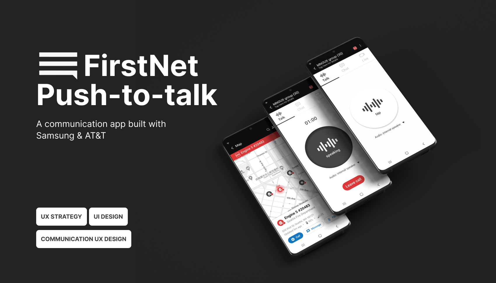
Simplify PTT Panel

Challenges
Users were overwhelmed by multiple communication options (voice, messaging, video) with no clear prioritization.
Options considered
- Keep all features equally visible
- Create separate modes for each communication type
- Prioritize a primary action with progressive disclosure
Decision
We prioritized a primary communication action based on context, while allowing secondary options to be accessed when needed.
Trade-offs
This reduced immediate visibility of some features, but significantly improved clarity and speed in high-pressure situations. Users are able to quickly navigate to needed features and therefore uplifting the communication efficiency.
Confusion Eliminated on Emergency Alert
Challenge
Emergency alerts are time-critical, yet users faced confusion due to unclear triggers, inconsistent UI patterns, and lack of feedback after activation. In high-stress situations, hesitation or misinterpretation could delay response.
Decision
To eliminate confusion, I replaced the icon with a notable SOS symbol, based on user research showing that responders are familiar with traditional radios featuring a red SOS button for emergencies. Additionally, when an emergency alert is sent, the entire header turns red and flashes to quickly signaling the need for support, a concept inspired by traditional radios.
Trade-offs
Reducing steps increased the risk of accidental activation, but this was prioritized against the need for speed and clarity in emergency scenarios.
Automation of Location Reporting

Challenge
Manual location sharing required additional steps and attention, which is unrealistic in fast-moving or high-pressure environments.
Options considered
- Keep manual location sharing for full user control
- Trigger location sharing only during specific actions (e.g., emergency alerts)
- Automate continuous or context-based location reporting
Decision
We initially introduced automated location reporting based on context, reducing the need for manual input while ensuring up-to-date positional awareness. However, developers suggested to avoid that due to battery consuming. Eventually, we have upgraded the map display to show realtime location at a certain refreshing rate, depending on first responder’s status, i.e., Emergency Alert or device battery. The new map will automatically refresh, eliminating the need for manual refresh or verbal confirmation by dispatchers.
Trade-offs
Automation reduced user control and raised considerations around battery usage and privacy, but significantly improved reliability and reduced cognitive load during operations.
Informative map for dispatchers

Challenge
The information provided on the map was often limited, requiring dispatchers to rely on additional verbal communication to fully understand the situation. Dispatchers needed a clear overview of multiple responders, but existing map views lacked clarity, hierarchy, and actionable insights.
Options considered
- Display all available data points on the map
- Allow full customization of map layers
- Prioritize essential information with structured visual hierarchy
Decision
To address this challenge, we displayed responder affiliation, battery statuses, and signal strengths on the map. This empowers dispatchers to quickly assess the situation, including responder locations, responders availability, and specific needs without requiring verbal communication.
Trade-offs
Increasing on-map data—such as responder affiliation, battery status, and signal strength—introduced higher visual density and risked clutter, potentially impacting readability.
However, this trade-off was intentional. By surfacing critical operational signals directly on the map, we reduced the need for back-and-forth verbal confirmation and enabled dispatchers to assess responder availability and constraints in real time.
This shift prioritized faster situational awareness and decision-making over minimal visual simplicity, aligning with the needs of high-pressure coordination environments.
Just send out messages and we do the rest

Challenge
Dispatchers sending broadcast messages lacked visibility into whether responders had actually received or read the message. As a result, communication reliability depended heavily on repeated verbal confirmation across channels, increasing cognitive load and slowing down coordination in time-sensitive situations.
Options considered
- Keep existing messaging behavior and rely on verbal confirmation workflows
- Introduce manual acknowledgment requests for critical messages
- Enhance messaging with system-level signals for broadcast intent and delivery visibility
Decision
I introduced 2 features to the messaging to empower dispatchers. First, enhancing the existing broadcast message by introducing the symbol “@all” ensuring all users are aware this is a broadcast message which is usually more critical in first responding. Second, senders can see who has read or unread the message, without requiring message senders to confirm with recipient and vice versa. It greatly reduced the verbal confirmation.
Trade-offs
Introducing read-status visibility and broadcast labeling increased system complexity and introduced potential concerns around perceived surveillance and information overload for responders. However, this was balanced against the operational benefit of significantly reducing repetitive verbal confirmation loops, which were a major bottleneck in fast-moving coordination scenarios. In this context, improving coordination speed and clarity was prioritized over maintaining a purely low-signal messaging interface.
The impact
Following the redesign, internal feedback indicated improved clarity and reduced confusion during task execution. Stakeholders reported better alignment around product direction and priorities. Also, early validation sessions with users suggested improved navigation efficiency and reduced time to initiate communication.
- Responders are able to trigger Emergency Alerts within 3 seconds, marking a 81.2% improvement.
- Time to detect Emergency Alert was reduced by 84%.
- Time to assess situations and send specific support needed reduced by 76%.
- Time to verify a message read reduced by 66.6%.
While long-term quantitative impact is still being measured, the redesign established a scalable foundation for future product growth and usability improvements.