
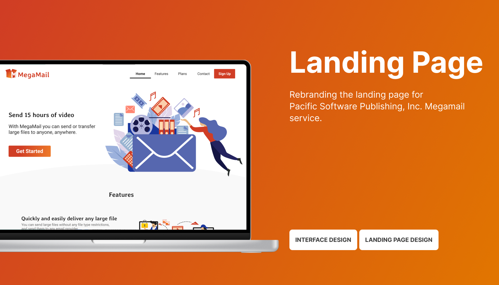
What is MegaMail
MegaMail is an easy and secure way to transfer large files from one computer to another.
Why do I redesign the landing page
PSPINC introduced a new product, MegaMail, to grow its business. However, the landing page struggled with low sign-ups and a high bounce rate.
As the product designer, I redesigned the landing page to reduce friction, clarify the value proposition, and increase conversions.
My role
I’m the sole designer in this project. I was responsible for the visual design and front-end development, working along with a design manager, a project manager, and a developer.
Why the current Call to Action (CTA) buttons don’t work
Paradox of Choice

Multiple competing CTAs diluted user attention and introduced decision friction, ultimately reducing engagement with the primary call to action.
Redundant CTAs increase cognitive load

Multiple buttons leading to the same destination created false choices and diluted the clarity of user intent. They need to be consolidated actions to reduce cognitive load and strengthen the primary flow.
Lacking of visual hierarchy
Without a consistent color code, competing colors drew equal attention and disrupted the visual hierarchy, reducing CTA prominence. The brand color, orange (#C14931), has been used as a background color and also CTA buttons.
Strategy
I approach landing page design with a focus on clarity, hierarchy, and decision-making.
Rather than presenting every feature at once, I prioritize communicating value quickly, reducing cognitive load, and guiding users toward a single primary action.
By establishing a clear visual and CTA hierarchy, using color intentionally, and progressively disclosing information, I aim to minimize friction and help users act with confidence.
Solutions
Creating a style guide

I created a design guideline. This help myself stick to the colors and typography. “Orange (#13DE25)” is the main color of MegaMail. I blended it with its complementary colors – “Blue (#19369C)”. Also, I added tints to orange and blue to generate more colors and applied those colors to the site. This would make the whole website more consistent.
Additionally, I used colors #13DE25 and #E07C3D, which are from the Logo, to create a gradient effect on the button. This would help strengthen the brand.
Communicate product value

To achieve this, I rewrote the headline and introduced an animation to highlight the key benefits of the product. I also used bold, relevant illustrations to quickly capture attention while visually communicating core features.
Placing a single primary CTA in the hero section helped focus user attention and strengthened the conversion path, resulting in higher click-through potential.
To reduce drop-off and streamline exploration

Backend analytics showed a high bounce rate on the landing page, indicating that users were leaving without engaging with any actions—including the “View more features” button. Further review revealed that the feature detail page offered little additional value and largely repeated information already shown on the landing page.
Based on these insights, I consolidated all key features into a single, scannable section on the landing page instead of separating them across multiple pages. This allowed users to get straight to the point, and access essential information without unnecessary navigation.
I also introduced illustrations and applied colors from the new style guide to improve readability and create a more engaging visual experience.
Strategic use of color cues guides users’ choices

To guide users toward the recommended plan, I highlighted the preferred option by using color while desaturating secondary options, reducing decision friction and emphasizing hierarchy.
Impact
- Shipped a redesigned landing page UI for MegaMail, a file transfer web app, converting 5% of visitors into customers.